Project Overview
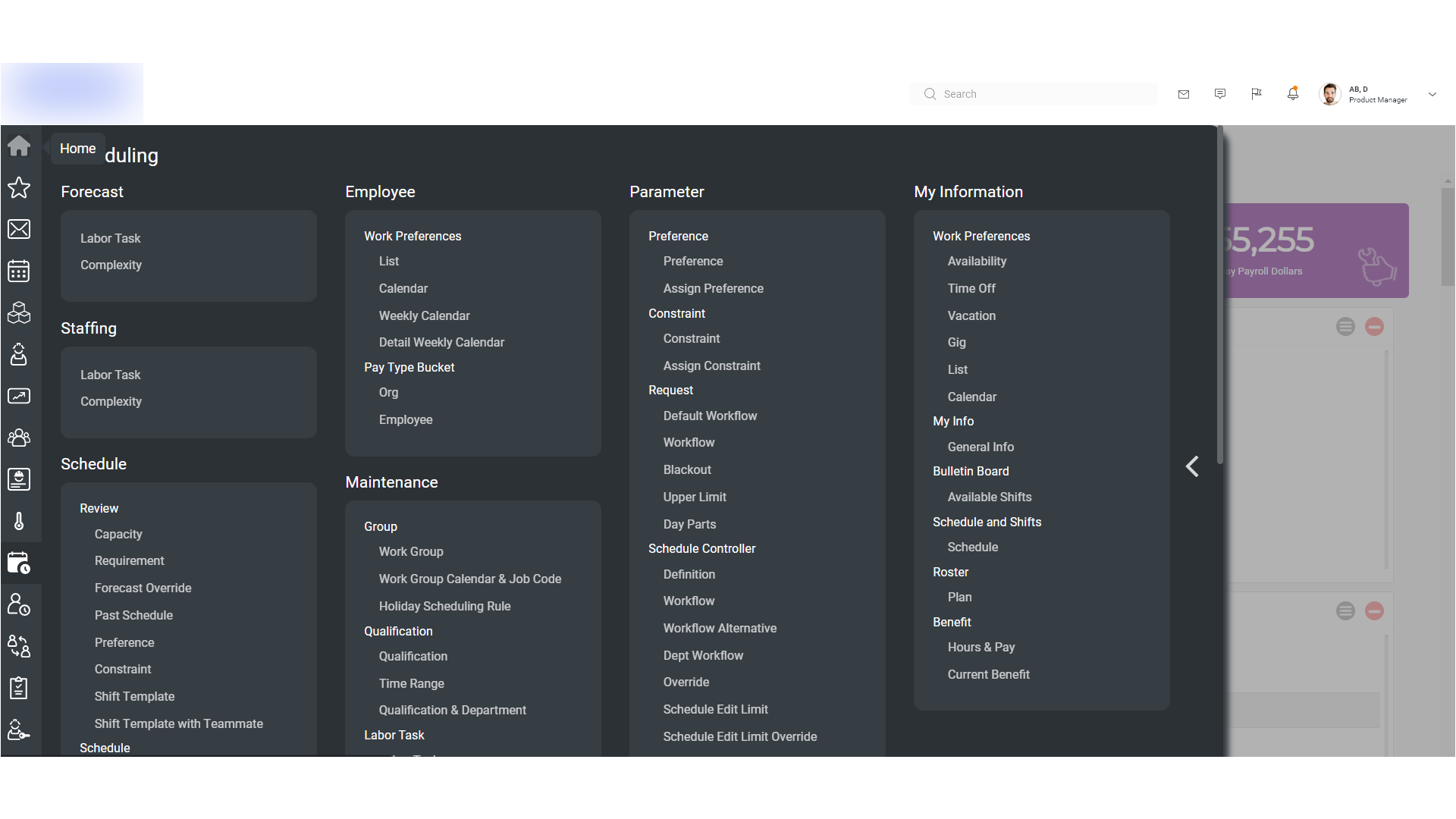
Logile’s web application originally featured a dense, horizontal navigation bar overloaded with modules and deeply nested submenus. This made the experience cluttered, inconsistent, and inefficient — leading to poor discoverability and user frustration.
Through collaborative brainstorming, usability research, and iterative design, we restructured the navigation system with a left-aligned vertical menu, backed by an improved information architecture. The result is a streamlined, intuitive, and scalable experience aligned with modern SaaS UI standards.
Context & Challenges
- Complex Navigation: Too many items crammed into a horizontal menu with deep nesting made the system overwhelming.
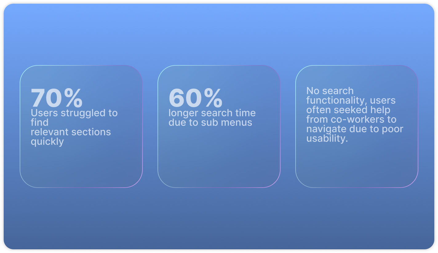
- Poor Searchability: No universal search — users had to remember where features were buried.
- Cognitive Overload: Cluttered interface with repetitive and unclear labels.
- Inefficient Workflow: Users spent more time navigating than completing tasks.
Goal
- Simplify and declutter the navigation interface.
- Make content easier to locate via improved structure and labeling.
- Reduce menu depth for quicker access to primary modules.
- Optimize navigation for both desktop and tablet users.
- Introduce a global search bar to improve page/module discoverability.
Research & Insights
To better understand user frustrations and expectations we ran a mixed-method research effort:
- User Interviews: Spoke to 15+ users including store managers, support teams, and internal stakeholders.
- Competitive Benchmarking: Studied modern SaaS platforms with scalable navigation systems.
- Card Sorting: Conducted sessions to group related features and validate mental models.
- Label Audit: Reviewed current menu labels with CX and PM teams to identify redundancy and confusion.
These activities reinforced the decision to adopt a vertical menu structure focused on simplicity, efficiency, and accessibility.
Key Insights
- Natural Eye Flow: Vertical scanning aligns with user reading patterns.
- Scalability: Vertical layouts accommodate growing modules without overwhelming users.
- Responsiveness: Vertical navigation performs better across screen sizes compared to crowded horizontal menus.
- One-Click Access: Frequently used modules became accessible with fewer clicks.
- Pattern Consistency: Left vertical navigation is a familiar SaaS convention, reducing learning curve.
Design Process & Solution
1. Card Sorting & Grouping
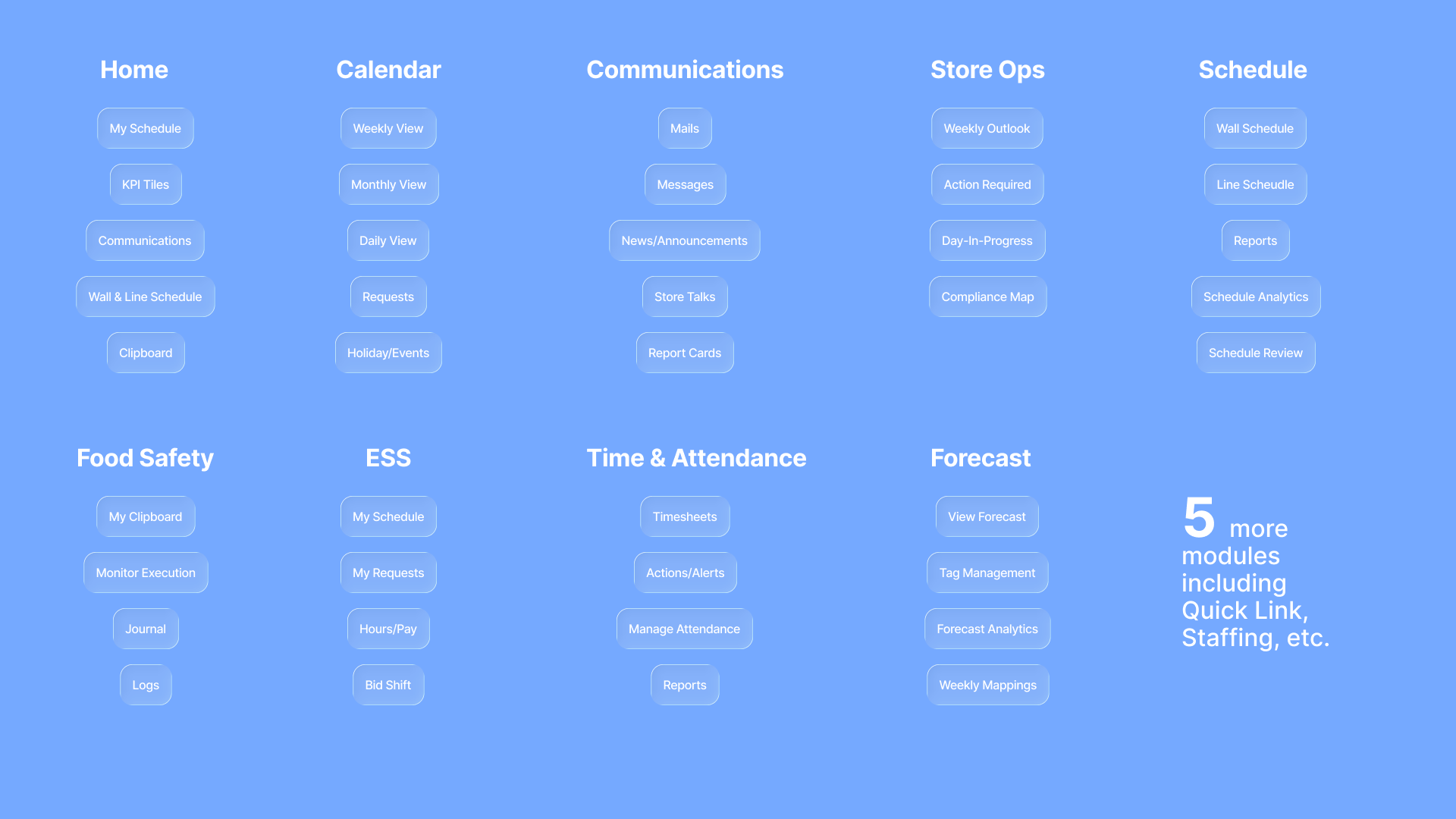
Collaborated with PMs to regroup 50+ navigation items into logical module clusters. Each group was narrowed to 4–5 actionable subcategories.
2. Menu Hierarchy Redesign
Introduced a two-tier system:
- Primary Menu — Main modules (left vertical).
- Secondary Menu — Utilities (profile, help, notifications) accessible from a compact area.
Renamed confusing labels to be action-oriented and intuitive.
3. Information Architecture Mapping
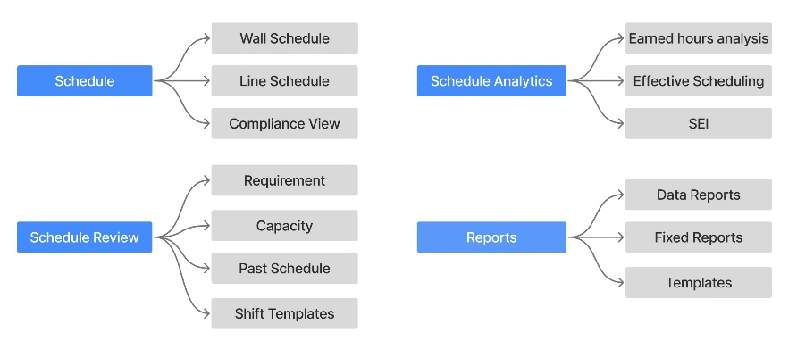
Mapped each module and sub-section to visualize the new structure. This alignment helped the team and reduced rework during development.
Main Menu Exploration
We tested multiple layout options and captured usability feedback:
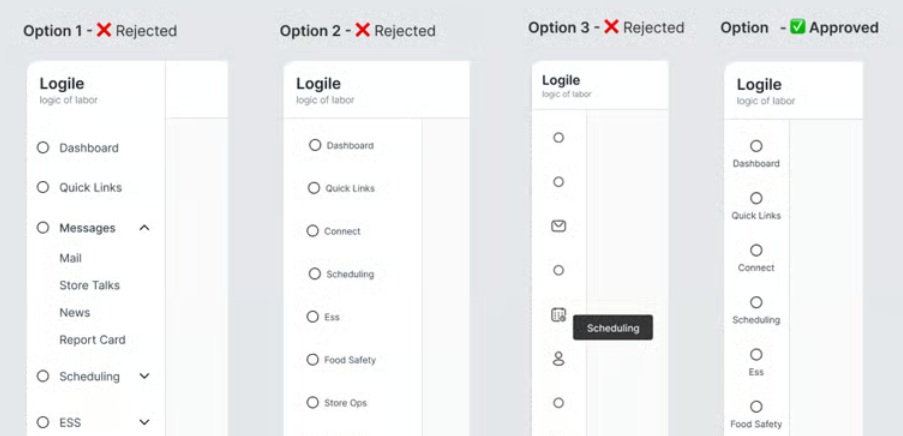
- Option 1 — Nested Vertical Menu ❌ Rejected — Still required multiple clicks; did not solve usability concerns.
- Option 2 — Right-Aligned Menu ❌ Rejected — Took excessive screen space; poor for smaller devices.
- Option 3 — Icons Only ❌ Rejected — Minimal but unscannable; users couldn’t recognize icons for unfamiliar modules.
- Option 4 — Left Vertical Menu with Icons + Short Labels ✅ Approved — Balanced clarity, accessibility, and compactness.
Other Implementation
Subsection Layout Exploration
After finalizing the main navigation, we explored subsection layouts:
- Option 1 — 4-Quadrant View ❌ Rejected — Limited space and not scalable for modules with more than four subsections.
- Option 2 — Tab-Based with Nested Tabs ✅ Adopted — Top-level groups as primary tabs with nested tabs inside. Clean, scalable, and familiar.
Search Functionality
One major usability gap was the absence of a global search. We implemented a global search bar in the top header next to universal actions. The search provides smart suggestions and halves the time to find modules.
Final Implementation
- Clean left vertical navigation with icons and short labels.
- Logical grouping of related modules with simplified hierarchy.
- Global search bar with smart suggestions.
- Clear separation between primary actions and utility functions.
- Responsive behavior optimized for desktop and tablet.

Results
- 40% faster navigation time during usability testing.
- Significant reduction in cognitive load and confusion.
- Improved onboarding experience for new users.
- Search feature cut module-finding time significantly.
- Positive feedback from internal teams and early testers.
Conclusion
By replacing the complex horizontal navigation with a thoughtfully designed vertical menu reinforced by strong information architecture, intuitive labeling, and universal search, we significantly elevated usability, efficiency, and satisfaction. The new system solved immediate friction and provided a scalable foundation for future growth.